How could I not be won over by designer Gary McBournie, whose favorite color is orange and cites Auntie Mame as a movie that continues to provide him with design inspiration? Looking through his book Living Color is like joining a celebration of colorful interiors and the designer’s contemporary twist on tradition.
 Opening with a charming chapter filled with personal photos and paintings, it is immediately apparent that he has had a lifelong love of the visual and a thoughtful eye for connections between art, nature and design.

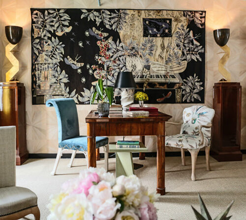
But it was his first visit to Nantucket in the late 1980’s, where his interests in history, gardening and life came together. Now on his fifth house, McBournie shares my love of the grey lady, where inspiration comes from so many sources. He has also worked on many clients’ homes there such as this “grand summer cottage” overlooking the historic harbor. A previous renovation had stripped the house of much of its period allure but, using cheerful colors and inviting upholstery and accessories, McBournie revived the house’s island charm. I love that the designer used the reverse side of the hand-blocked Lee Jofa floral linen to add a sense of patina. And there is a wonderful mix of textures, from the cane coffee table to the blue ultrasuede on the backs of the chairs.

In the master bedroom, a water-inspired mix of blues is anchored by a Holly Hunt bed the designer painted white. Green accents in the trim and custom rug from Stark add a fresh youthful touch. Yet the room still feels luxurious in its creature comforts – crisp white linens from SFERRA and a beautiful mohair throw that I assume must be from the wonderful Nantucket Looms.

I love how McBournie has injected the classic all white kitchen with personality. The painted green cabinet interiors add life and connect the room to the rest of the house. And details such as the matchstick blinds, antique stool and use of the pot to hold utensils inject warmth and soul into what is often a lifeless white box.

Another blue and white bedroom for a client’s Florida home shows McBournie’s talent in created appealing rooms with few fabrics. A simple stripe is transformed into campaign style bed curtains, making full use of the tall ceilings, and pieced for a fun graphic on the pillows. This guest room is for visiting grandchildren so the designer added sea-grass trunks at the foot of each bed which do double duty as “treasure chests” and warm nautical accessory.

For color loving clients downsizing in Boston, McBournie exercised a lively palette of saturated colors. The designer accommodated their love of Manuel Canovas fabrics in the guest room which is swathed in his fabulous Bengale toile, complemented by a rug from Stark and linens from Matouk.

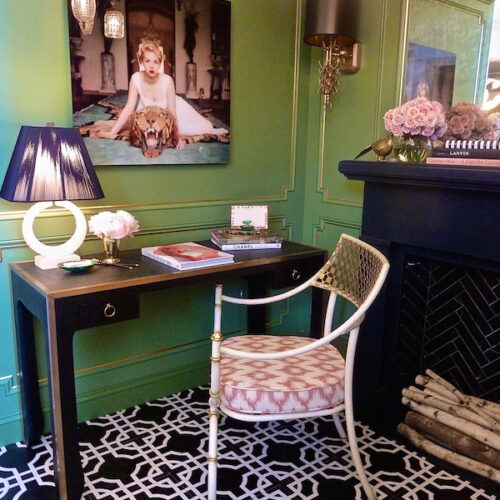
In McBournie’s own Boston pied-à-terre, he created a jewel box in orange and brown. Here the bedroom is a soothing yet dramatic space filled with personal details and accessories such as intaglios found at a Paris flea market and a watercolor from an American artist living in Rome. A small David Hicks pattern on the headboard, bedskirt and curtain lead is the perfect foil for the strong lines of the Frette linens and chocolate brown walls, which cleverly conceal the soffit and wall jogs.

For a Montana ski house, McBournie again turned to orange to bring the colors of the “Big Sky” sunsets indoors. For a dark family room, the designer brightened the walls and added texture with a Phillip Jeffries grasscloth. A collection of disparately sized bird prints were all framed the same to add unity. But of course the designer couldn’t leave the room completely neutral so added a bright vermillion on the chairs and a cheerful pattern on the ottomans, yielding a cozy room with upbeat visual interest.

And while the designer specializes in rooms with color and contrast, he knows when to pull back. In a NYC duplex loft McBournie designed this elegant bath, evoking the glamour of 1920s New York hotels with a classic mosaic floor and Waterworks Empire tub. For a subtle reference to the colors in the bedroom, McBournie added a Sunbrella stripe to the sculptural bench.

This is a volume filled with personality. With personal reflections, helpful decorating tips and stories and inspiration behind many of the designs and color choices, McBournie has shared a wealth of information. One to remember as lovely gift or addition to your design library!

I am seeing a reccuring trend of movies inspiring designer homes in lately. I love the house on the water in Head Above Water with Cameron Diaz. -MN
McBournie melds traditional with modern hues so perfectly. Definitely a great book to own. Thank you Stacey for the introduction.
Cheers!
Looks like we need to add this one to the coffee table, too! What a great sense of color and we love the twin beds. Auntie Mame is a great source for inspiration.
xxoo
C + C
I’m lusting for the Montana ski house “look.” It impresses me that the designer uses multiple personalities…no pigeon hole look here. franki
One of our favorite designers, for sure and love the way he mixes styles and textures flawlessly. The twin bedroom in Florida is gorgeous!! Have a great weakend ~