Tamara Kaye-Honey has a distinctive point of view and her creative nursery at the Hampton Designer Showhouse is a perfect vehicle for her “New Vintage” style. The unexpected use of bold colors and dark paint gives the room an urbane edge. “I really think kids spaces should be a continuation of the main living spaces and be both sophisticated and playful. Childrens’ spaces need not be themey or overly colored in primary colors. We want our children to grow into their rooms and have an appreciation and understand of quality and good design.”
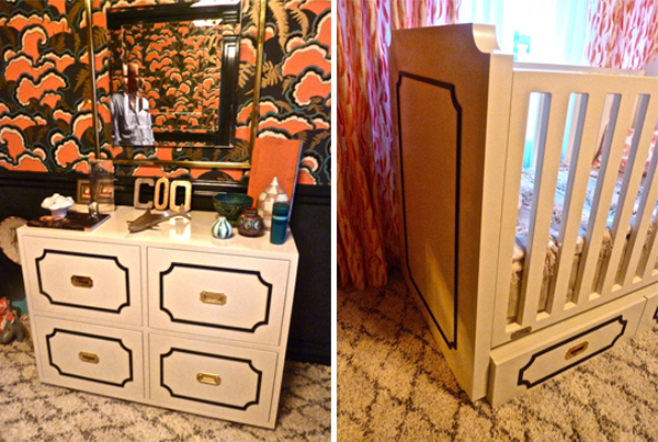
The LUSH wallpaper designed by Mary Kysar of the Portland based Makelike studio set the stage as a dramatic design statement. Featuring five-colors, including metallic gold, it is hand-screenprinted and impactfully paired with the Pratt & Lambert Anthracite on the walls and Lulu DK’s new children’s line for Schumacher at the windows.
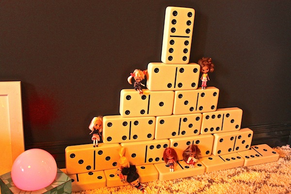 This sophisticated backdrop plays well with the many whimsical elements in the room. Kaye-Honey said that young visitors to the showhouse appreciated all the low placed child friendly accoutrements.
The room showcases Kaye-Honey’s new Uptown furniture collection she recently designed for Nurseryworks. With a nod to Dorothy Draper and a Chanel-like black and cream palette, the lacquered pieces are fresh yet classic. “Designing furniture is a natural extension of what I do as an interior designer and it allows me to create pieces that represent my style and truly showcase my New Vintage vision.”
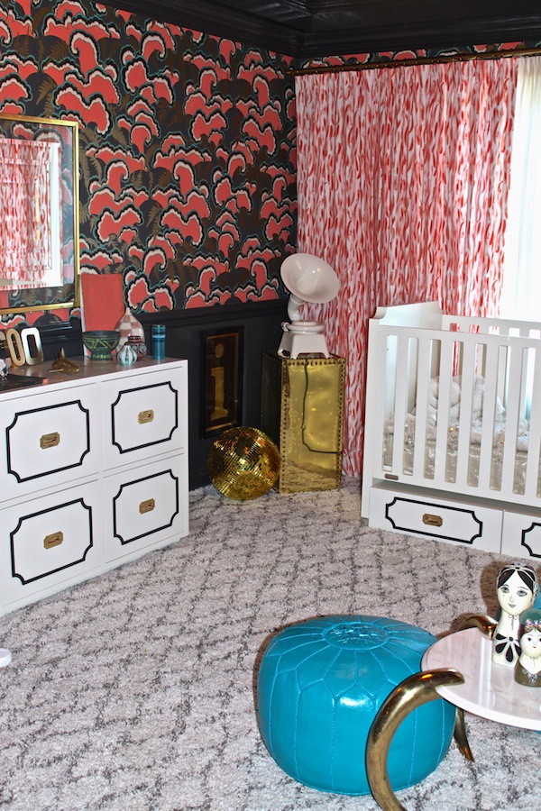 I love that they can outlive toddler time, easily segueing into tween years and beyond. The crib is cleverly designed to transform into a twin by turning the end piece on its side to become a headboard.
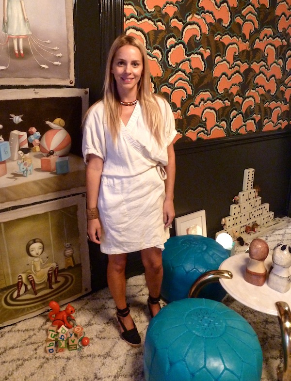
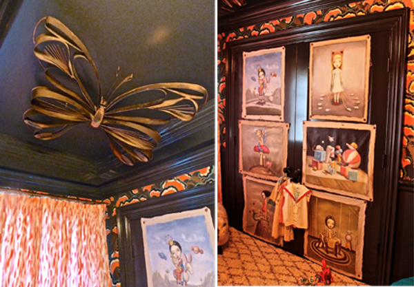
The room’s personality and charm are enhanced by the selection of art and layered accessories. Vintage items such as the 1950s Curtis Jere butterfly sculpture, Mark Ryden-like oil portraits
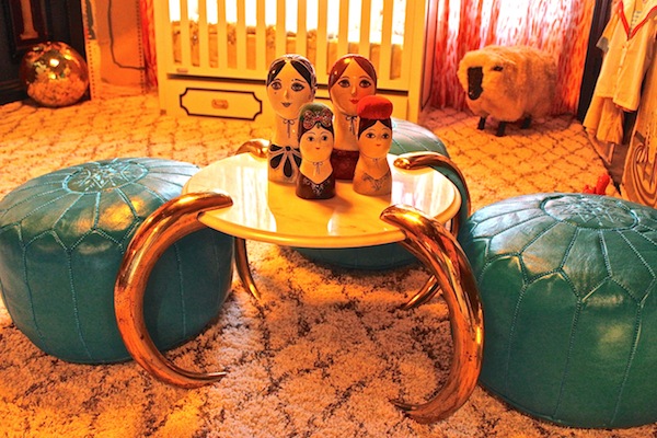
and one of a kind pieces from Kaye-Honey’s Pasadena store House of Honey, mix with new items like the Serena and Lily Moroccan poufs.
I loved the creative energy in Kaye-Honey’s unusual and eclectic room. The exuberant mix of old and new, of artisanal and vintage and brave blending of bold pattern and color are so original. “I like to think it’s both sophisticated yet whimsical. I pushed the envelope and created a sense of theatrics and drama with the space by using layers of pattern and pops of color to energize and inspire. I hope viewers find it to be an unexpected and playful experience! One that makes them grin and hopefully remember.”


I’m so sorry, looked forward to seeing this room and find it dreadful. The conflicting, nearly disturbing patterns and garish colors can’t be soothing or comforting for a child (two elements essential to sound sleep and inviting quiet time. The carpeting appears 1950s and odd as well as the paneled effect at bottom of crib and chest – black?? The gold on the mirror and small table are out of place (can’t think of a place where they would work at all!. Hate to be so critical, but given the gorgeous surrounding rooms earlier displayed here – I don’t know how this room made it – the paintings seem out of place (dark wall behind); even the toys bizarre. EXIT, bug on ceiling! No not to new vintage.
We love the unexpected combos in this nursery! Tamara really has a gift for whimsical vintage mixes in her work (and her shop that we love!) must have that butterfly sculpture!!
I don’t like it. In fact, I hate it, but…I’m not a designer. Perhaps the design’s artistic elements fly right past my untrained eye? But then a child’s room should not be like a piece of fine art that one must study to appreciate. It’s just not pleasing to look at so it fails my test.
I suspect if these colors and accessories were shown in every design magazine, blog, etc. “they” would be the norm. Never dreamed I would be using LIME green in my kitchen! :) franki
Looks very dated like something from the late 60’s or 70’s not my taste nor does it flow well with the rest of the homes interiors.
Showhouses are a venue that allow designers to create fantasy — with no client and no budget. The rooms are not meant to be really lived in nor are they supposed to work with any of the other rooms in the house. Showhouses are all about taking chances to really showcase your limitless talents and endless possibilities. Tamara’s kept true to her new vintage style and dialed it up a notch to create buzz about the room–love it or hate it. We happen to love it!
I absolutely love it! Love the wallpaper and overall how the room isn’t babyish! I have always loved Tamara’s nursery works line and the Dorothy draper feel to that crib and dresser! Love the eclectic look of this room!
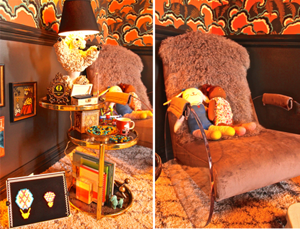
I like that Tamara went bold and took a risks by designing this space in an “unordinary” way. I use quotations because most wouldn’t find this nursery the norm or appealing. It makes you think outside the box, which is what a show house is all about–making the homeowner see new possibilities of what could be & stretch your design tastes. I think she did a great job with her new vintage style…hit it right on the money! Love the wall paper, and the nursery chair is amazing!
http://www.donnaviningblog.com
Love this room! So creative! Love every aspect!!! Beautiful!!! What child wouldn’t be inspired to live in a room like this!
I have to say that I find this room over-stimulating and unbalanced. Maybe because I’m judging from the pictures and haven’t seen the room in person. Where does the eye rest? It bounces around the room from the patterned carpet, to the wall covering, to the drapery fabric, to the wall art, and to the butterfly on the ceiling (yes, I know that’s for the baby to see when lying in the crib). Stacey, is it different in person?
Sorry, I think this is creepy…it would be perfect as a set for Lemony Snickett though!
The kids I know would LOVE Tammy Connor’s room!
I don’t like this nursery at all. I have never seen a worse design concept for a nursery in fact. Too bad – I was looking forward to seeing it.
I am also a designer and believe the room here is pure genius. I didn’t find it to be at all “too busy”, as someone else had commented. Black is its own white-space; the eye rests as easily on black walls as on white walls, and the carpeting is a neutral color, not busy at all. I’m actually disappointed that there aren’t more people able to appreciate the room and low-brow art. But beauty is in the eye of the beholder and one cannot always please everyone’s taste. I’m not surprised that more people aren’t able to appreciate the complex irony and paradox that is low-brow art. I really love this room! Mainly because the room and art IS loosely inspired by “the god-father of pop surrealism,” Mark Ryden. I’ve been a fan of Mark Ryden for many years now, but too, the table and toys are reminiscent to the half-breed toys we see in the Toy Story movie. And anyone that has had or knows young boys will also know that taking toys apart and attaching them willy-nilly with other broken toys, well, that is what young boys do. Also, I am seeing a lot of Russian influence here; the coquelicot, black and gold of the wallpaper and curtains, the blue-green of the pouf seats and the gold elements (table legs, etc). Each of these colors are rooted in Russian culture; i.e.– Khokhloma (Russian painted kitchenware), and then too, the little Russian nesting dolls. Also, loving the Dorothy Draper furnishings and butterfly on the ceiling. This room is fun!